The marketing team behind The Simpsons have been hard at work. Going into their 20th season (wow!), their fire is far from diminishing. From the success of the Kwik E-Mart/7-11 takeover and the partnership of Burger King last year for the movie launch, the famous yellow family are still at it again. . . Gentle Giants toy manufacturer has produced the Treehouse of Horror series, while Burger King is looking forward to another partnership. On The Simpsons’ website, there’s a partnership with Zazzle for seasonal products in honor of Dia de Los Muertos, cleverly titled, “D’oh of the Dead”. Click here to check out The Simpsons’ (awesomely-designed) site.
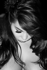
Beauty defined. Simple black & white portrait via the digital Canon XTi.
The loveable characters of Wallace & Gromit lend their charm to the ads for lifestyle store, Harvey Nichols. Click here for more details.
If you’re interested in learning more about digital photography or getting new project ideas, check out Photojojo.
I’ve also placed a few artwork pieces on an artist social networking site, Blue Canvas. The Flash player is pretty nifty–artwork becomes embedded into the module and viewable in a seamless way.
This artwork was created while in a Halloween mindset. The concept was to replace a human backbone with a snake and a ribcage as wing elements. It veered away from that a bit, so I may revisit the theme a bit more later. The influences for this piece were artwork from Giger (bio-mechanical elements), mysticism, tattoo art, and alchemy (symbols in the background). Traditionally drawn with pen/ink, then scanned, and digitally colored. Larger image here.
I love this figurine–Frida Kahlo immoratalized as a Dia de Los Muertos handicraft in San Francisco.
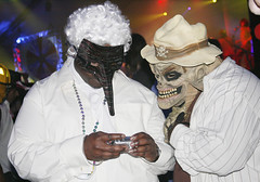
Halloween–when in costume, everything appears amusing–even mundane tasks such as looking at the camera/cellphone.
I’m a strong believer that there’s beauty in everything no matter how mundane. This photo is of geometric simplicity from the top of a ship.
It’s (drumroll please). . . HALLOWEEN! Ta da!
Here’s a mixed media piece to celebrate my favorite holiday of the year. I’ve always loved Victorian scrolls and banner style, but thought it would be interesting to substitute certain artistic elements with insect legs and bone fragments–it’s subtle, but gory. Buahhaha! This was done in pen/ink, then scanned and colored/manipulated in Photoshop.View Larger Image.
As with all my projects, I do loads of research beforehand–trying to get into the core of the product, theme, or event. I notice that Voodoo (or Vudon/ Vodoun) is something that scares a lot of people in the Western world because of what has been portrayed in horror movies and the media (as with Wiccan beliefs). Researching it made me understand that it’s a valid religion not particularly associated with darkness, but with all things, there are a few bad apples along the way. More info here. It’s a cliche, but knowledge is power–to understand differences and realize similarities. As an artist, I find that researching unfamiliar topics broadens my creative vision and style.
In the voodoo research, chickens are used in religious ceremonies. The black chicken is used to absorb evil spirits, while the white chicken is used to cleanse the spirit. Influenced by this, I did a little creative licensing. In my artwork, the body of the chicken houses spirits, while it’s plucking away at savory little eyeballs. The drawing was first created in pencil, then cleaned up, and digitally colored and texturized. View Larger Image.
Designed this while I was on the cruise to Mexico: View Here. Precursor to my Halloween e-card.


