I’ve contemplated whether I should post this artwork up. As a commercial graphic designer, you are in a constant space of negotiation, seeking approvals, business etiquette, and customer service. With fine arts, it’s based primarily on the artist’s intention, so sometimes, when misunderstood, there is more scrutiny. Throwing caution to the wind, here’s my two cents. . .
About this piece: I’ve always been drawn to political and social art, especially propaganda pieces. Regardless of the society and the context, political art is powerful and many are great works of design. The I Want You Poster and George Orwell’s theme “Big Brother is Watching You” (1984) inspired this piece.
The intention of this is more social than political. The artwork and message is a reminder that society is not as rosey as it may seem–we have to be aware of ourselves and of the world we live in with respect to those around us. Orwell’s words gives the artwork a slightly ominous slant, but just don’t take this too seriously. The presence of eyeballs and the ultra-bright red color lightens the subject matter, making it more approachable in a tongue-in-cheek humorous way. I recreated Uncle Sam in my simplified linework style. Originally intending to create an apparel design, this may have a better life as a poster.
Incredible sights to behold on July 11, 2008. It’s very exciting to have a few of my photos published on The Crucible’s Festival Photo Recap Page.
Designed by Sherrie Thai of Shaire Productions.
Illustration created in Adobe Illustrator and Photoshop.
I created this Eastern style dragon over the weekend. My goal is to produce one new illustration a week.
Here’s a nifty tribal shirt available on my Zazzle shop
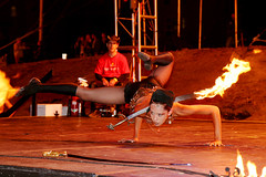
I photographed this Iron Monkey dance crew member at The Crucible Fire Arts Festival. Although blurred, I think this photo captures the speed and technicality of break-dance movements. I just purchased a digital Canon XTi camera, so I had a bit of fun experimenting with the slow shutter speed.
Roxrite vs. Lilou-Red Bull BC One 2007 Roxrite has an amazing range of movement that’s just incredible to watch. Don’t blink!
This is a recent design project promoting a Beijing Games app. The project scope was to create several profile skins highlighting several countries, so on my part, it was a test in creating a brand which was able to extend to different markets. My background in identity and package design was pretty helpful–color and design elements help differentiate the brand in unique ways. The digital illustration was created in Adobe Illustrator and the layout was created in Adobe Photoshop.
Fire Vortex is a live sculpture of fire from the mind of Nate Smith, displayed at The Crucible’s Fire Arts Festival in Oakland. This was one of the most incredible sights I’ve ever seen. Witnessing the taming of the flame and constant evolution of shape was beautiful.
It was so hot I was worried that my new lens would melt somehow, but luckily all is well. For more info, check out Nate’s site: Fire-Arts
I created this design for the Dark Knight Campaign. As with most movie campaigns, the artwork was already in existence, so I just had to concentrate on extending the brand through photo collages and creating supporting artwork. This is where research is essential–if I didn’t have just a day or two to turn something around, I could easily spend a week on research. I feel very blessed to have the opportunity to touch different and exciting campaigns that I admire.
The concept was inspired by the Gotham Times site with interactive Flash-based elements. If you’re interested in seeing the real sites for The Dark Knight, check out my other posting about their guerrilla marketing campaign.


