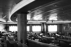
Part of the World Famous Dance Crew photoshoot.
Lovely geometric curves and lines.
Bucky Paper,, or carbon nanofiber (an achievement of nanotechnology), has been in the works for a few years now. It’s suppose to have the dexterity of regular paper, could be cut with scissors, yet be as strong as steel. Sounds like the Superman of papers, eh? I wonder though–if and when it hits the commercial market–how affordable would it be and would the general public have access to it? The speculation for uses is pretty impressive:
biological applications, replacement of metals for usage in planes, tv’s, and more. Instead of “going green”, we could “go bucky”. (Cheesy, I know) This power paper could perhaps lessen the need for certain natural resources–metal and wood–but of course, I’m no scientist, so hopefully, it’s environmentally sound.
As an artist/designer on the constant lookout for new materials, bucky paper sounds very promising. Besides the noble uses for it, this could open new doors for printing technology–if it is in fact printable. Fast-forward to a world with affordable bucky paper. . . Given that we live in a user-generated society–we could perhaps place personalized artwork on household furnishings–countertops, refrigerators–or even cars and bikes. Perhaps textbooks for schools? Or simply having archival gallery materials.
Taken at the State of Grace Tattoo Show in San Jose, California.
This dragon was originally created in pen/ink and vectorized on the computer. I’ll eventually create another design with this circular shape for a tee design, but for now, enjoy it digitally. =0)
For a larger view, click here.
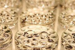
Simple textures of glass cups with the Canon XTi.
The marketing team behind The Simpsons have been hard at work. Going into their 20th season (wow!), their fire is far from diminishing. From the success of the Kwik E-Mart/7-11 takeover and the partnership of Burger King last year for the movie launch, the famous yellow family are still at it again. . . Gentle Giants toy manufacturer has produced the Treehouse of Horror series, while Burger King is looking forward to another partnership. On The Simpsons’ website, there’s a partnership with Zazzle for seasonal products in honor of Dia de Los Muertos, cleverly titled, “D’oh of the Dead”. Click here to check out The Simpsons’ (awesomely-designed) site.
Beauty defined. Simple black & white portrait via the digital Canon XTi.
The loveable characters of Wallace & Gromit lend their charm to the ads for lifestyle store, Harvey Nichols. Click here for more details.
If you’re interested in learning more about digital photography or getting new project ideas, check out Photojojo.
I’ve also placed a few artwork pieces on an artist social networking site, Blue Canvas. The Flash player is pretty nifty–artwork becomes embedded into the module and viewable in a seamless way.
This artwork was created while in a Halloween mindset. The concept was to replace a human backbone with a snake and a ribcage as wing elements. It veered away from that a bit, so I may revisit the theme a bit more later. The influences for this piece were artwork from Giger (bio-mechanical elements), mysticism, tattoo art, and alchemy (symbols in the background). Traditionally drawn with pen/ink, then scanned, and digitally colored. Larger image here.


