Posted by Sherrie Thai of Shaire Productions.
As technologies change, so do the materials and techniques involved with printing. Spectrum Lithograph offers a Lithofoil printing, where foils are printed with the 4-color process, adding depth to most artworks.
For durable products, Polyart papers are the practical choice. A unique clay coating keeps the paper from tearing, yet is smooth enough for writing.
New Leaf Paper has nice recycled paper stocks that any environmentally-conscious designer can appreciate. They seem to be the leaders for recycled stocks since they don’t bleach their materials and have experimented with non-wood papers.
Posted by Sherrie Thai of Shaire Productions.
Gothic Beauty is a classic portrait inspired by Roman busts and vampire movies. The medium is mixed–graphite on paper and digital coloring. A tribal dragon is tattooed onto the shoulder. The teardrops represent a perpetual sadness and loneliness from a life as an undead. (This concept stems from a Zulu story of how a cheetah got her tears).
Posted by Sherrie Thai of Shaire Productions.
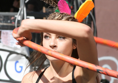
This candid photo entitled Hoola Hoop Girl was taken on the streets of San Francisco at the How Weird Street Faire (great event of music and pageantry).
San Francisco’s How Weird Street Faire was a fun outdoor event (much like the Love Parade), encouraging costumed revelry with an electronic twist.
Posted by Sherrie Thai of Shaire Productions.
Fashion of Pollution is a pessimistic view of climate and environmental change. This mixed media piece uses subtle colors, highlighting the seriousness of the subject.
Posted by Sherrie Thai of Shaire Productions.
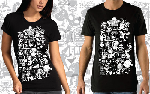
My dragon crest design was part of a TeeFury.com charity tee collaboration with 44 other artists on May 8th. Wotto collaged and curated the project and a percentage of the proceeds was donated to “Team Eagle”, a disabled parasailing team campaigning for the 2012 Olympics.
Posted by Sherrie Thai of Shaire Productions.
I’ve always been fascinated by the mystery of crytography. Art is a bit enigmatic to begin with, but infusing cryptography enhances its power. Artist James Sanborn is best known for his CIA sculpture Kryptos and is referenced in Dan Brown’s “The Da Vinci Code” book cover design. His work is highly conceptual, but simple in presentation. I love the Bauhausian quality of his structures, particularly his typography. The work speaks for itself, so additional decorations are unnecessary.
Posted by Sherrie Thai of Shaire Productions.
The calligraphic works of Monica Dengo is an inspiration into the possibilities of the written word. I took a class from her a few years back while she was in San Francisco. My interest in lettering stemmed from graffiti and her techniques helped me understand the traditional aspects of lettering.
On Monica’s site, she has a small, fascinating article on the “differences between graphic, calligraphic and gestural free approach of handwriting.” Read more.


